A health drink brand claims its sales have increased significantly. They present a bar chart where the bar for the current year is three times as tall as the bar for the previous year. However, the vertical axis (Sales) starts at \(90,000\) instead of \(0\). The actual sales figures are \(100,000\) units for the previous year and \(120,000\) units for the current year. Which of the following best describes the statistical abuse in this presentation?
Senior Secondary (HKDSE) · Mathematics
Uses and abuses of statistics: แบบฝึกหัด
ข้อปรนัย 5 ข้อ ตรวจให้ทันทีที่ตอบ และข้อเขียน 2 ข้อ พร้อมวิธีทำละเอียด ทั้งหมดจากเรื่อง Uses and abuses of statistics
A market research team is tasked with estimating the overall popularity of a newly launched high-end smartphone model among the general population of Hong Kong. They decide to conduct a survey by setting up a booth exclusively outside a luxury shopping mall and interviewing 100 people who pass by.
Which of the following statistical abuses is most likely committed in this investigation?
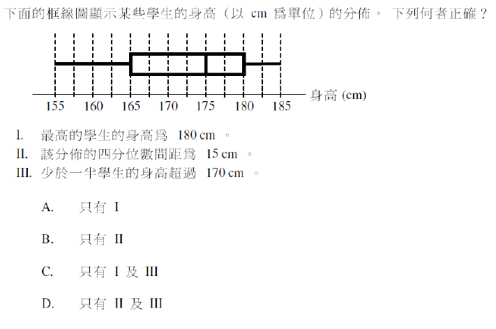
The box-and-whisker diagram below shows the distribution of the heights (in cm) of a group of players.

Which of the following must be true?
I. The maximum height is \(190\) cm.
II. The interquartile range of the heights is \(25\) cm.
III. At least \(50\%\) of the players are taller than \(175\) cm.
A fitness magazine publishes a bar chart comparing the weight loss of participants using two different diet plans. The bar for Diet A is twice as tall as the bar for Diet B, but the values labeled on the bars are 12 kg and 10 kg respectively. Which of the following is the most likely cause of this visual misrepresentation?
The box-and-whisker diagram below shows the distribution of the daily reading times (in minutes) of a group of children. The minimum, lower quartile, median, upper quartile and maximum of the reading times are \(10\), \(20\), \(35\), \(50\), and \(60\) respectively.
I. The median reading time is \(35\) minutes.
II. The interquartile range of the reading times is \(30\) minutes.
III. The range of the reading times is \(50\) minutes.
A city's Public Transport Department conducted a survey to evaluate the punctuality of the 'CityExpress' bus route. The following methods were used:
(a) To collect feedback on bus delays, a staff member distributed questionnaires to the first 50 passengers waiting at a specific bus stop near a major shopping mall between 5:00 PM and 6:00 PM on a Friday. Identify the sampling method used and explain one reason why this method might lead to a biased result. (2 points)
(b) One of the questions in the survey was:
"Considering that our drivers work very hard in heavy traffic to keep you on schedule, do you agree that the current bus frequency is satisfactory? (Yes / No)"
Identify the flaw in the design of this question. (1 point)
ลองเขียนคำตอบด้วยตัวเองก่อน แล้วค่อยเทียบกับวิธีทำ
A local marketing firm, DataSense, was hired by a new coffee chain, 'Caffeine Rush', to conduct a market survey in Hong Kong regarding customer preferences for coffee products.
Part (a): Sampling Method
DataSense implemented the survey by setting up a booth directly outside 'Caffeine Rush's' flagship store during its grand opening week (Monday to Friday, 12:00 PM to 2:00 PM) and interviewing 200 customers immediately after they purchased a product.
i) Identify and explain one major type of sampling bias introduced by this sampling method. (2 points)
ii) Suggest an improved sampling technique that DataSense could use to obtain a more representative sample of coffee drinkers in the district. (1 point)
Part (b): Questionnaire Design
One question in the survey was phrased as follows:
"Do you agree that because of the excellent aroma and smooth texture of 'Caffeine Rush's' espresso, it is superior to all other local chain coffees? (Yes/No)"
Explain why this question is poorly designed and suggest a better, neutral way to assess customer satisfaction with the espresso's quality. (2 points)
Part (c): Data Presentation Abuse
The CEO of 'Caffeine Rush' publicly announced the survey results: "An overwhelming 90% of respondents stated they were satisfied with the espresso quality." However, the accompanying graphic in the press release was a bar chart showing the 90% satisfaction rate, where the vertical axis was labeled from 80% to 100%. Explain how the graphical presentation attempts to mislead the audience. (2 points)
ลองเขียนคำตอบด้วยตัวเองก่อน แล้วค่อยเทียบกับวิธีทำ
* เนื้อหาของ thinka สร้างโดย AI อาจไม่ถูกต้องสมบูรณ์ในทุกกรณี กรุณาใช้เป็นสื่อเสริมและตรวจสอบกับเอกสารอ้างอิงอย่างเป็นทางการ
คุณเห็นเฉลยแล้ว ทีนี้มาตรวจคำตอบของคุณบ้าง
หน้านี้บอกได้ว่าคำตอบที่ดีเป็นอย่างไร แต่บอกไม่ได้ว่าคำตอบของคุณขาดอะไร thinka ตรวจข้อเขียนของคุณตามเกณฑ์ให้คะแนนจริงในราว 15 วินาที
อยากฝึกโจทย์แบบนี้เพิ่มไหม เริ่มฝึกหัวข้อนี้ได้เลย ตรวจให้ทันทีทุกข้อ
เริ่มฝึกเลย